
Typography is no longer putting words on the screen—it’s the simulation of reading words. As we near 2025, typography is moving away from linear typefaces to hyper-real, animated, and emotional language. Whether beginning or half way there in working, the nuances of typography are in focus of producing work that speaks in language and attitude.
Let’s talk about how typography is revolutionizing the future of visual storytelling—and how you can learn it from scratch.
Start from the Ground Up: The Essentials of Great Typography
All designers must have their feet on the ground before jumping on new and trendy things. Good typography at its simplest is founded on clarity, contrast, and balance.
The following are founding principles you should know:
- Typeface and Font: Title (i.e., Helvetica) is a typeface, and size and weight (i.e., Helvetica Bold 14pt) is a font.
- Serif and Sans-Serif: Serif fonts call up tradition and order, and sans-serifs call up modernity and simplicity.
- Hierarchy: Beautiful design guides the eye—use size, weight, and color to make clear importance.
- Spacing Matters: Figuring out kerning, leading, and tracking can truly make a humongous difference in readability and visual flow.
Typography is the skeletal system to which all design addresses—master it, and your designs will never whisper.
Designing for the Screen: Typography in UI/UX
Thanks to the mobile-first day and age, typography has to perform magic on screens. In 2025, designers care more than ever about scalable, responsive, and readable typography.
What to pay attention to:
- Variable Fonts offer responsive weight and width without multi-file bloat.
- Accessible Design needs high contrast, readable font size, and dyslexia fonts.
- Consistency Across Devices allows pain-free usage from desktop to mobile.
- Conscious typography is not an ornament—it informs, communicates, and engages.
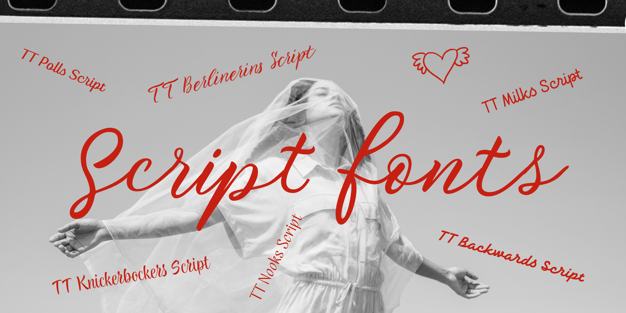
Typography Trends Defining 2025
Design trends come and go, but some redefine design itself. Bold experimentation meets genius design thinking in 2025.
What’s hot:
-
Kinetic Typography
Animated type combines movement and meaning—perfect for video, narrative, or UI animation.
-
Custom Typefaces
Custom typography is increasingly being an investment for brands as a way of constructing flawless visual identities.
-
3D & Extruded Lettering
Jump-off-the-page typography—literally. With AR, VR, and immersive websites on the rise, this movement brings drama and depth.
-
Brutalist Typography
Big, bold, in-your-face. This trend disregards all the “rules” for the sake of bare visual drama.
-
AI-Generated Fonts
Yes, AI is even creating typography today. Fontjoy and Prototypo are making it easy enough for anyone to create their own custom font with algorithmic support.
⚡ And these trends remind us that typography is no longer stasis itself—more like it moves, changes, responds.
Getting a Hold of Font Pairing: Harmony Over Hype
Font pairing is the art of harmony—choosing harmonious combinations which will not struggle with each other. Simple is the 2025 slogan.
Do:
- Use One Font in Various Weights: It creates simplicity and harmony in your color scheme.
- Change contrast moderately: Utilize a serif title and plain sans-serif body, i.e., Playfair Display + Source Sans Pro.
- Avoid Clash Fonts: Two simpler fonts will not fight with your message; they’ll drive it away.
Great font pairing is simple—just looks beautiful.
Typography in Practice: Real-Life Mastery
Want to witness theory? Look at the most innovative brands today:
- Apple: Their typography is modest clarity—never loud, always authoritative.
- Stripe: Their layout on the page uses hierarchy and white space to make full text readable.
- Web3 Brands on Awwwards: Web3 brands like kinetic and radical typography that stimulates the imagination.
Learning what works in nature both educates your eye and inspires your own creative voice.
Top Typography Tools Designers Love in 2025

Let Your Type Speak Loud and Clear
As 2025 trudges along, typography is a force to be reckoned with that dictates the way we read, feel, and engage in the digital world. It’s not readable anymore—it’s about word memorability.
So go ahead, whether creating a landing page, penning opinion columns, or introducing a brand from ground zero—let your type yell your vision loud and clear. Because in design, as in life, details speak.”.


